Teal is just ducky
I had no idea that yesterday’s thread on the difficulty of distinguishing between intermediate shades of green and blue would occasion so many comments, but I’m glad it did. Color is a topic that’s dear to my heart. I’ve always been very affected by color and very sensitive to gradations of color, which can drive me a bit nuts when choosing paint.
I decided to find out a bit more about teal, and it turns out that there are many shades of teal with some having more green in them and some more blue. That explains quite a bit. But I didn’t know that the color was named after a small duck called the green-winged teal. However, it’s not the wing part that has sparked the color name; it’s a stripe on the duck’s head.
Of course, when I tried to find an illustrative photo of the head, I found a whole bunch in which the stripe looked to be a different color in every one. But isn’t that what you’d expect, with teal?
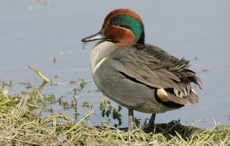
Photographed at Lindo Lake, Lakeside, CA. Original image: IR106708.CR2
Is that not adorable?
NOTE: Yes, I know the title is a pretty bad pun. Sorry, but I could not resist.
Neo, as others discussed on the thread yesterday, computer and phone screens vary in their representations of color. It may not be the ducks cranial stripes varying, but the digital representation of the color varying among the images.
But, as it is a duck, it still radiates evil from every pore.
I get a lot of ducks here including little Green Teal. They are usually hanging with pintails. Mallards and Common Merganser drakes have green heads that can look blue or purple depending on the light. I have been testing cameras for streaming the wildlife around here. The ducks have been pouring in the last few days.
Also, only the drake has the green head stripe but both hens and drakes have a teal green wing patch. No other female duck around here has a green wing patch.
Maybe just me, but I don’t recall ever hearing “teal” as the name of a color before…I don’t know…sometime in the ’80s or early ’90s? I assumed it was something fashion-y decorator-y people adopted. Whereas I was aware of the waterfowl as long ago as I can remember.
SCOTTtheBADGER, I guess you’ve seen this well-known meme:
https://i.redd.it/ozzjzntcgp021.jpg
There’s a guy on YouTube who likes to Photoshop uniform redesigns. Here’s his “Thread Fix” for the Miami Marlins: you just know he prefers a return to the old teal-as-a-primary-color look of the early 1990s:
https://www.youtube.com/watch?v=gH0D1ZXaeJo&ab_channel=NoahQehzy
RTF will notice the Photoshop specifications on the screen to allow for differences in computer monitors.
The teal portion of Thread Fix begins around 1:26.
A survey of Marlins fans when the team celebrated its 25th anniversary in 2018 indicated that a majority of the fans preferred the old teal/black colorway to the present color scheme: https://www.sun-sentinel.com/news/sound-off-south-florida/fl-sp-marlins-teal-uniforms-follow-20180607-story.html
Last, Teal Man (a bad imitation of Mr. Met) showed up at a Marlins game in the mid-1990s, to the amusement of the announcers:
https://www.youtube.com/watch?v=604Hrlytwwg&ab_channel=nuufish
I wore teal scrubs for two years, and hated them every day. They were not improved by the fact that the maintenance man insisted that the AC was working just fine, (It was not) so that, at the end of every day shift, I had a sort of collar of dried salt from the sweat I shed, but that is not the reason I hated teal.
It is a shade, an ugly shade, and not a color. Like a majority of men,. I like forthright colors, red is red, blue is blue, etc. Don’t f… with it. I do not even like teal on women, and, to me, most colors and shades look good on a woman.
In 2001, I saw the aurora borealis in Michigan. The sky was a bright teal color. Teal is my favorite color because that was my first time seeing the aurora.
Well, these aren’t teal ducks, but I thought Neo might like this video anyway: in Thailand, a growing number of rice farmers are using ducks for pest control, and the duck breeders can let the juvenile ducks feed on the parasites in the rice paddies instead of having to feed them until they’re fully grown:
https://www.youtube.com/watch?v=A3N6BG9owwk&ab_channel=SouthChinaMorningPost
The blue-green / green-blue continuum does seem to be an “issue” in the male/female perception “wars”…(with males tending toward the blue end of the spectrum IIRC and females leaning greenward).
Wonder if there’s a genetic component… (Cf. the flavor of cilantro leaves…)
There also appears to be differences in perception on the yellow/green continuum. E.g., shades of (the infamous) chartreuse…
(May these be the worst of our problems….)
Barry Meislin–
You might be interested in “The 22 Worst Named Colors of All Time”:
Chartreuse is listed as #9, after Caput Mortuum (#4) and Bastard-Amber (#7); but there’s also Lusty Gallant (#11– actually a shade of pink); Goose Turd Green (#12); Puke Green (#13); and Drunk Tank Pink (#18).
https://www.color-meanings.com/worst-named-colors/
I have a color story that happened at work.
I picked up from our cabinet maker the entire service desk package for a Volvo dealer it was entirely done in laminate.
Unloaded the cabinets and another guy and me started installing them.
As employees came in got the usual joke that’s the wrong color. A good hour later someone of authority showed up and said stop, that’s the wrong color.
The cabinet maker had a laminate color name only not a sample and ordered it from manufacturer. I don’t remember the name exactly but it was a woman’s kind of name so I will use Maryann.
What he got he used not knowing it was wrong,all cabinets had to be taken back and stripped of laminate.
The color was a Barney Purple
PA…
Well I sure am glad that SOMEONE is keeping tabs on these things…
(And certainly something to keep in mind the next time anyone brings up “Rainbow Coalition”…)
Curious thing though, I understand all of those creative paint-by-off-color joke names except for “Bastard-Amber” (which comes in at lucky #7)…unless it’s a company-wide in-joke company, though maybe someone had it some sort of grudge—perfectly understandable—for Armand Hammer… (To be sure, prolonged exposure to all those paint/chemical fumes can wreak havoc with one’s sense of humor…other senses, as well…)
Hmmm. Now that I think of it, I don’t quite understand “Barney Purple” either. Could be another in-joke, I suppose (an expensive in-joke at that, at least in the case described—though for a while there in the 70s, Volvo should have had its dealerships—ALL OF ‘EM—painted “Lemon Yellow”)…unless it’s a take off on Barney Miller?? Barney Rubble? Barney Frank? (Paint fumes again?…)
As for Maryann…
…don’t know the color but, well, can’t help it, I simply love the song…
Maybe it’s time for a repost:
https://www.youtube.com/watch?v=aLOnQmmmlkw
Barry,
This is my favorite Maryann song:
https://youtu.be/PsrS2aBxMEw
Hmmm, must be a thread here somewhere (for a slow blogging day, perhaps).
Crenshaw is someone I really do not know (not a surprise, to be sure as there’s a whole lot out there I don’t know)…but listening to that recording, I kept asking myself whose voice Crenshaw’s reminds me of…and then it occurred to me: Tom Petty.
Not only that, but the riff is also Petty-esque…. Somewhat, at least. More than somewhat. To my ears…
Uh oh…
As this duck appears on my computer screen, his head coloring is cinnamon and … green.
Re: Chartreuse…
Not sure why, but every time I see the word, my brain serves up a hot red color, then I remember the liqueur and correct it to a lime-green.
…YMMV…
Learning to Fly:
https://www.youtube.com/watch?v=s5BJXwNeKsQ
(Apropos of ducks…)
“…this duck…”
Yup. (“Cinnamon” is a nice touch!)
The great thing about being a father, and more so a grandfather, is that bad puns are part of the job.
I am unfulfilled if in the presence of my girls their eyes don’t roll at least once.
Barry, Marshall Crenshaw is worth a deep dive. Writes great songs and since the late 1980s is a really, really good guitar player. He was pretty good before but watching him play of late makes me very happy.
Marshall Crenshaw is also one of three rotating front men The Smithereens have worked with since the sad passing not quite five years ago of Pat DiNizio.
Barry, I could have used the birding term “rufous” for that duck, but “cinnamon” is what it looks like!
About a decade ago my wife tipped her toe (and follicles) into the Clairol (not Chlorex) world of hair dyes. Egyptian Plum was a choice, IIRC, the shades and hues were astounding. Fortunately she outgrew it.
Thanks Kate for that. A new word is always welcome! (Especially a bird word).
(Though from a glance through the various definitions, it seems that “rufous” is a bit on the flexible side, though brownish red—or reddish brown—does seem to dominate….)
Actually, there are three ducks with the word teal in their common name. As named blue-winged teal and green-winged teal, the color is on the wing. Audubon App describes the cinnamon teal as “chestnut” in color!
Cinnamon Teal have blue wing patches as do Blue Wing Teal. Only Green Wing Teal have green wing patches. Wigeon drakes have green head stripes too but only during mating season. Common Merganser drake heads are only green during mating season.
Barry Meislin says @ 7:49 am, “Now that I think of it, I don’t quite understand “Barney Purple” either.”
You don’t remember Barney the purple dinosaur, PBS’ gift to higher culture?
“Barney is a purple anthropomorphic Tyrannosaurus rex who conveys educational messages through songs and small dance routines with a friendly, huggable and optimistic attitude.”
Like this one: https://www.youtube.com/watch?v=GjbR9rHI9Vw&ab_channel=love0music013
PA Cat,
Barney was a T Rex?! Wow. I never caught that.
I’m definitely culturally challenged I’m ashamed to say.
I admit it. Full stop. No excuses.
My cultural development attenuated. Atrophied. Arrested (is that an intransitive verb?). Stopped. Died.
Sigh. My whole life is just one big disappointment.
A letdown. A waste. I didn’t even know huggable T-Rexes existed. Where did I go wrong??
(Wait! Small solace but I actually DO know Big Bird…and Placido Flamingo, well not personally…. But does that count for anything?…)
(So is “Bastard Amber” one of Barneys twisted pterodactyl galpals?)
Teal is just a four-letter word.
PA Cat —
Let’s not forget Apartment Green, which my mother identified as the standard paint scheme for apartments going back to at least the ’50s, as was backed up by my experience of living in crappy apartments for ten years. Even if the walls were currently white, if you took the phone jack box off the wall you could see where the previous paint was Apartment Green.
Michael Adams —
Au contraire, I like the color teal, although more as an accent color. Back in the ’80s when I was a recent college graduate trying to get office jobs, I had this beautiful silk teal paisley-dot “power tie” that I unfortunately spilled grease on and ruined.
Barry Meislin–
I’m culturally challenged too, particularly when it comes to popular music. Neo’s posts on the subject are meaningless to me; I have yet to listen to a single one of her Bee Gees videos and find her obsession with the group’s music incomprehensible. I don’t “get” any of Gerard Van der Leun’s “Boomer Anthem” posts either, even though I’m a Boomer by age group. I was trained in classical music and still turn to it when I want to get Jo-Jo’s or Jen Psaki’s voice out of my ear canal. I guess there is such a thing as being a hopeless musical nerd.
As for Barney Purple, I was introduced to the color by an aunt’s remark that “it’s so ugly it would make the Baby Jesus cry.” That made me look up the PBS children’s show just to see what Barney looked like. The color does tend to sear the retina as well as the memory, doesn’t it?
Brian Lovely–
My experience with underlying paint colors is that I was more likely to find Army Barracks Khaki under the phone jack than Apartment Green, but YMMV depending on the part of the country you were living in.
And I like the color teal too; I can spot my old teal Mercury easily in the supermarket parking lot, now that so many newer cars are white or silver.
Now do “turquoise”….
PA Cat —
What with all modern cars looking pretty much the same, color is important. So it’s especially annoying that all the car companies seem to follow the same trends in color selections.
I used to have a Saturn in what I called “2004 Blue”. I can’t tell you the number of times I tried to open the door on a Toyota or Honda, because until you got right up onto it you couldn’t tell the difference.
Michael Adams commented, “Don’t f… with it.”
I think he could have written, “Don’t LET’S with it.”
PA Cat,
If you really want to get nauseated watching Barney, try to pay more than 2 minutes’ attention to any of the scenery chewing child actors, whose stage mothers are likely just outside of camera range encouraging little Jill or Johnny to, “Sing out, Rose!”
Randall Munroe surveyed 200,000 people about colour names, it’s probably the definitive list. But YMMV…
https://xkcd.com/color/rgb/
@ Ben David > “Now do “turquoise”…”
Back when we still had kids, we drove a Suburban long enough for it to need a new paint job. AesopSpouse took it to the shop and ordered a nice light blue.
When it got done and he brought it home, I said, “That’s not what you told me we were getting.”
It was a brilliant turquoise.
Color disagreements were not new at our house, and I’ll just leave that there.
We drove back to the shop, the office clerk hauled out the paint chip book, and pointed to the sample. Sure enough, it was a nice light blue.
I took the book outside into the natural light, rather than the yellowish fluorescents that were standard at the time, and it was sure-enough brilliant turquoise. I don’t know if we were the only disappointed customers, so I hope more people remembered to check their chips in the light in which they will be viewed (which works for house paint as well – what’s in your light sockets?)
We got quite fond of the color though. I never again lost my Suburban among the sea of blue & grey clones in the Walmart parking lot.
I have it on good authority that it was even visible in the camp-ground parking lot from the top of a pretty high peak.
which works for house paint as well
Works for fabric too. If you’re going to make an outfit out of two different black fabrics, take swatches outside and make sure they’re actually the same black.
Or navy blue, red, etc. It’s just that I have more experience with black.
Or whatever light you’ll be in. A couple of years ago I whipped up a simple dress for the woman I was dating. It was for an event night at the goth club, so I made it in white so it would glow under the black lights that were going to be on for that night. But it just looked gray, because it was a multi-layer knit that just kind of swallowed the light into its texture instead of reflecting. Except that the zipper and the thread in the seams glowed just fine, which just looked weird.