Is it blue or is it green?
My ex-husband and I used to have a running argument about colors.
Before you say “no wonder you got divorced—what an asinine thing to argue about!”—let me just say that it wasn’t a hostile battle. It was a mild, intermittent, slightly silly, tongue-in-cheek-but-a-bit-serious-as-well disagreement about blue vs. green.
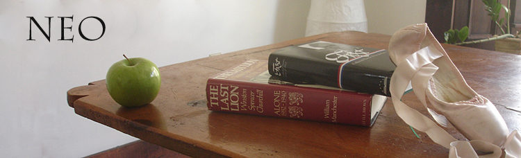
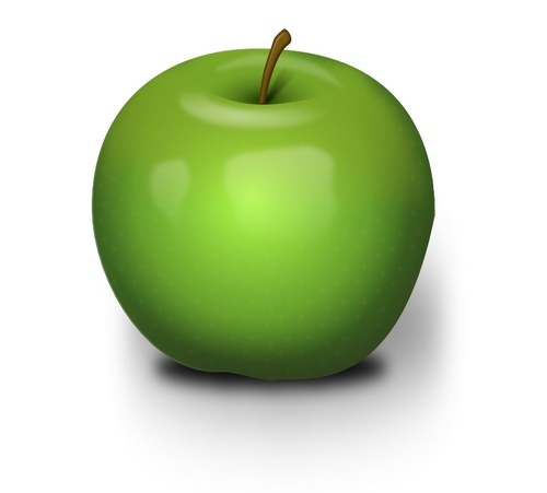
We agreed on some things. For example, this was undoubtedly green:
And this was blue as blue could be:

Ah, but those gradations and shades in between! Where oh where to draw the line?
The distinctions between colors are not arbitrary, but neither are they exact. And since the names of colors also are not infinite, we have to make decisions about categories of color and where they end.
When does green segue into blue, and back again? One individual can choose a different point than another—as can entire cultures and people in different language groups.
My ex-husband and I were from the same culture, but he was a man and I a woman (still are, in fact). Did that matter? Men are more likely to be color-blind, but that was not the case with my ex-husband. He could see colors well enough, as could I. Our differences had to do with naming them.
If you think that the naming of colors is a simple thing, you would think wrong. Think about those endless paint sample cards in the hardware store, and all those fine gradations between hues, and then think of the people who have jobs coming up with names like “Amazon Moss” and “Champion Cobalt”
Wiki lets us know how different cultures see it:
Different cultures have different terms for colors, and may also assign some color terms to slightly different parts of the human color space: for instance, the Chinese character é’ (rendered as qÄ«ng in Mandarin and ao in Japanese) has a meaning that covers both blue and green; blue and green are traditionally considered shades of “é’.” In more contemporary terms, they are è— (lé¡n, in Mandarin) and ç¶ (lÇœ, in Mandarin) respectively. Japanese also has two terms that refer specifically to the color green, ç¶ (midori which is derived from the classical Japanese descriptive verb midoru ‘to be in leaf, to flourish’ in reference to trees) and グリーン (guriin, which is derived from the English word ‘green’). However, in Japan, although the traffic lights have the same colored lights that other countries have, the green light is called using the same word for blue, “aoi”, because green is considered a shade of aoi, similarly green variants of certain fruits and vegetable such as green apples, green shiso (as opposed to red apples and red shiso) will be described with the word “aoi”.
Lest you think these strange distinctions are an Asian thing, remember that English has its oddities as well; we just don’t think of them as odd at all:
Similarly, languages are selective when deciding which hues are split into different colors on the basis of how light or dark they are. English splits some hues into several distinct colors according to lightness: such as red and pink or orange and brown. To English speakers, these pairs of colors, which are objectively no more different from one another than light green and dark green, are conceived of as belonging to different categories. A Russian will make the same red-pink and orange-brown distinctions, but will also make a further distinction between sinii and goluboi, which English speakers would simply call dark and light blue. To Russian speakers, sinii and goluboi are as separate as red and pink or orange and brown.
I never thought of pink as light red. But of course it is.
A Catholic blogger I follow once posted a list of things he thought men wanted their wives to know. One was: “We only see in 16 colors. We have no idea what mauve is”.
When I was a kid we had a set of cereal bowls with pastel interiors. There was one that I saw as green and everyone else said was blue.
They were wrong, of course.
I’ve seen several articles on the net claiming that people in the past “couldn’t see blue.” But that’s a misleading way of presenting the fact that different cultures have different words and draw the lines between colors differently.
Women do in general seem to have a finer eye for color, though perhaps it’s a matter of attention rather than actual perception. Over the years my wife and I have had a number of exchanges that went like this:
She: [words] the blue one [words]
Me: What blue one?
I recall one case in which I thought the blue one was white. Upon being challenged, I still thought it was white but admitted it had a very very faint blue cast. If I remember correctly it was a chest that had been painted white over an original blue, but the white hadn’t adequately covered it.
It can be other colors, not just blue. Generally it involves some intermediate case like the above: is it greenish-brown or brownish-green? However, recently I’ve discovered that there is a certain shade of dark blue that presents itself to me, at least at first, as purple. In this case I know I’m the “wrong” one, because one day we were with two of our grandsons and I observed that we could get ice cream at “that purple building”. All three of them said “what purple building?”
English splits some hues into several distinct colors according to lightness: such as red and pink or orange and brown. To English speakers, these pairs of colors, which are objectively no more different from one another than light green and dark green, are conceived of as belonging to different categories.
That makes me wonder if there are any languages that refer to “grey” as “light black” or “dark white”?
I draw the blue/green distinction differently from other people. Glad I’m not the only one.
I actually once set up one of my classes to look at a spectrum projected from a prism, and had each student indicate what range of the spectrum they associated with each color name. (For simplicity we used 6.) It was interesting that there was more variation on green/blue demarcation than on red/orange/yellow/green demarcation. I didn’t keep the stats I collected as it wasn’t a robustly-designed experiment. But it could be done and probably has.
I drive an ancient Mercury sedan (it really is old enough to vote) that is a blue/green color that I’ve always called “teal,” but the Department of Motor Vehicles considers “turquoise.” One of my friends calls the old heap “green,” while another buddy calls it “greenish blue.” Go figure. Apropos of the same color, I can remember when the Miami Marlins were not only called the Florida Marlins, but began their early seasons wearing uniforms described as a “classic 90’s teal and black colorway. Both a home jersey and home vest, worn with a teal undershirt, [were] used.”
You can see those unis here: https://mlbcollectors.com/MIAjerseys.php
Sports Illustrated made fun of this un-traditional color choice by referring to the Florida team as the “Men of Teal.”
Incidentally, while cats’ color vision differs from humans’ in several respects, they can see green and blue:
https://www.youtube.com/watch?v=40ujKFD3z2g&ab_channel=ZoneA
What they call those colors is another question, though.
PA Cat:
I was originally going to add a part in this post about teal confusion, but I figured the post was already long enough. But teal is notoriously difficult to agree about
Teal is easy…the color found on the head of a certain Eurasian duck.
I’ve always believed that the way we see color is undoubtedly caused by our own unique chemical makeup and this can be why it is difficult to always agree on color differentiation. But I also believe that seeing color has to do with how we compartmentalize colors as Neo’s essay points out. So it seems to come down to the age-old conundrum nature or nurture (better, nature AND nurture).
It’s not just men and women who may perceive colors differently.
In my late 20s, my 2 yr. older brother and I were once camping in the Mojave desert. At the end of the day, we were watching the sunset and drinking a few beers. When the colors were most intense, he turned to me and said, “man look at those purples”. Puzzled, I replied, “what purples?”
At that time I had 20/20 vision in one eye and 20/10 in the other.
I see the color purple perfectly fine but the paler the pastel, the harder it is for me to distinguish between them.
T:
OTOH I was never taught where blue ended and green began.
Over time I heard people say green, green, blue, green blue, blue about various items and I just made up the boundaries on that limited data set.
As a kid I made up lots of stuff while figuring out the world. I was very surprised when I later looked up some of the words I thought I knew from conversations in the dictionary.
I was in an art class many years ago. We were working with chalk pastels. We were to make a still life of a bleached oxen skull. I has no idea what to do – how to draw something that is white on paper that is white? The teacher came around to check my work and saw that I had done nothing. I was perplexed. All I see is white. The teacher said to me “don’t you see the blues and greens in the skull?”. Nope, not then, and not now.
Yawrate–
I don’t think the (original) Marlins would have taken much comfort from the fact that the color called “teal” is derived from a duck. As it is, one of the other names for the team that got serious consideration in 1991 was “Florida Flamingos.” Imagine the color that would likely have been chosen for a team called the Flamingos . . . .
Back to teal: I’ve always thought that teal was part of the color scheme for the unis of the Seattle Mariners. It is, but the team prefers to call it “Northwest Green.” Sure looks like teal to me, though, and I notice that Wikipedia describes the team’s current colors with the t-word in parentheses: “[The Mariners] adopted their current team colors – navy blue, northwest green (teal), and silver – prior to the 1993 season.”
https://en.wikipedia.org/wiki/Seattle_Mariners
Steph:
You might enjoy this quote from “Cat’s Cradle”:
___________________________________
“No wonder kids grow up crazy. A cat’s cradle is nothing but a bunch of X’s between somebody’s hands, and little kids look and look and look at all those X’s . . .”
“And?”
“No damn cat, and no damn cradle.”
–Kurt Vonnegut, “Cat’s Cradle”
There are a lot of interesting videos about this. My favorite one is only about 3 minutes long, as it’s very succinct — https://www.youtube.com/watch?v=2TtnD4jmCDQ
This one’s from last year and is about 6 and a half minutes — https://www.youtube.com/watch?v=D1-WuBbVe2E
Blue is between about 500nm to 520nm, and green between 520-560, so the transition is at 520nm. 519.9 blue; 520.1 green. See! fixed it for ya! 🙂
My ex husband and I are both artists. We disagreed about color all the time. What I said was blue, he said, no, that’s purple. I said that’s green, he said no, that’s blue. I said that’s pink, that’s red, that’s green. He said, noooo, that’s red, that’s orange, that’s yellow. lol.
But, we often worked on the same projects, mixing the exact same colors, so we had absolute proof that we saw colors exactly the same, we just called them different names.
I’m going to say that he had a better technical art education, so he was probably right about the names.
Huxley:
Very good!
physicsguy:
Kermit the Frog is glad to know where he fits on the electromagnetic spectrum, because it’s not easy to hit that 520-560 nm frequency:
https://www.youtube.com/watch?v=rRZ-IxZ46ng&ab_channel=JayB7869
Some people with two X chromosomes (formerly known as “women”) may be “tetrachromats”, having four kinds of cones and enhanced color differentiation compared to us “trichromats”.
https://en.wikipedia.org/wiki/Tetrachromacy#Humans
There are degrees of color blindness, I think, and I experienced a modest “blindness” or reduction of perception, for red, especially as viewing stained bacteria thru a microscope at 1000x many years ago.
But what the hell, I have a pretty nice art collection (to my eyes!)
Right off hand don’t know the number how many variations of colors the human eye can see, but think it’s hundreds of thousands.
Ferrari’s red/orange or orange/red throws me into a loop
The dress was white and gold, dammit. I don’t care how many people said blue and black, I know what my eyes saw!
I wonder about the extent to which cataract formation affects color perception in older adults. I had cataract surgery two summers ago, and like many people who have had it, I was surprised by the freshness and vividness of the colors I saw after the surgery. Some types of cataracts involve the gradual deposit of a brown pigment within the lens of the eye, which would certainly affect color perception as well as general sharpness of vision.
It didn’t take my wife too long into our marriage to comprehend that I simply do not see colors (or distinguish color) the way she does. Sometimes, like neo and her husband, we would have detailed discussions, to attempt to get to what’s going on. In those times, when forced, I usually could distinguish between colors about as well as she. If she held up two things I was calling, “blue” right next to one another I would agree that they were not identically colored.
As neo wrote, some of it was certainly vocabulary. I hardly ever use more than about 10 words to describe colors; black, white, blue, green, red, yellow, orange, brown… I can see pastel colors but I’ve never bothered to learn their names.
I think that was the biggest revelation for my wife; I simply do not care. The mechanics of our retinae may be equal*, but she has a much greater interest in color than I do.
*And, I don’t think the mechanics are identical. I do believe my eyes and/or brain, are not as good at distinguishing color as my wife’s.
When I was in my teens I hit about an evolutionary reason for this that made sense to me (I may have even read it somewhere), and seems to bear out what I observe in most women and most men. Come back with me, 150,000 + years…
Men cannot bear children. Women can. No children, no evolution. For various, different and obvious reasons* it makes sense to send the men out on expeditionary stuff, like hunting. How do you tell if an animal is safe to eat? Movement. It’s alive and moving**.
Regarding the tribe’s larder, the women spend a lot more time gathering; fruits, vegetables, grains, berries, roots, nuts, legumes… How can you tell which ones are ripe, non-poisonous… Color.
If a tribe had women who were inept at distinguishing color gradations the tribe died of dysentery, beriberi, scurvy, poison. Tribes with women who were adept passed those genes on along the x chromosome to their daughters.
*Women need more body fat to carry feti and nurse infants. They have extra internal organs to do these things, so men are typically stronger, faster… Most importantly the men are much more expendable than the women. Women are way too valuable to risk on hunting expeditions.
**Most men can watch sports for hours; physical movement. Patterns of movement. Also, many sports rely on basic, physical skills analogous to hunting; throwing, running, aiming…
And, to physicsguy’s point, light has physical properties and they can be measured. However, like sound, it seems some of us are “tuned” to certain frequencies more than others and gaps may seem greater or lesser to us than they they actually are.
Wow. WordPress just entirely killed a comment I was trying to make about a tech company where I worked which attempted to set a digital color standard.
According to science, there are an infinite number of colors on the spectrum as well as an infinite number of shades of each color. [Can we argue that no two people see color exactly the same way? By definition.]
According to women, there are probably more than that.
For men, we have red, orange, yellow, green, blue, purple (indigo ain’t no kind of color ’round here and violet is a girl’s name), pink, gold, silver, white, black, gray, and brown. That’s 13. But since I always liked the movie line, you might be able to talk me into adding piss yellow and puke green.
https://www.youtube.com/watch?v=JFgTMYEaWlc
I’m just trying to enter a comment about color scientists and the problem of color being perceived as the same under different conditions, but I keep falling through some trap door where WordPress stops letting me edit then kills the comment.
I wonder if it’s some overly zealous screening for r a c i s m.
Anyway. C o l o r is a hard problem in tech because we want a specified c o l o r to appear the same whether it is on a monitor, a projector screen or in print. It’s trickier than you might think
My company failed that mission and ended up successful with a line of printer servers.
Teal must have been tough on you two.
I grew up working in my Dad’s hardware store, mixing paint colors. It’s astonishing how many different colors of “white” there are.
I never thought this was important until I married. My wife has raised my consciousness about color and its importance. It never occurred to me that “white” could clash with “white”, that whites could be red, or yellow, or blue or brown, sharp or soft, warm or cold.
And now that I see it I can’t unsee it. Don’t anybody tell her, but she’s right.
This disagreement on the “naming” of colors and when one becomes the next one up or down the spectrum is why many states, CA comes immediately to mind, do not include color in the description of a vehicle. Another reason is the DMV would have to keep records of repainting.
My wife and I have color differences most often related to what I intend to wear. It usually starts with a scan and a curt “no”, or a “you’re wearing that…?” I attribute it to women are more into “outfit” where men just see pants and shirts as individual interchangeable items.
In Chinese the colour Pink is that for red with the ideograph for powder/dust preceding it. I don’t think it got much airtime until Hello Kitty & Co came along an eye blink ago.
Anyway… Epi oinopa ponton!
https://www.laphamsquarterly.org/sea/winelike-sea
Can’t remember if anyone mentioned this article in the previous thread about Greeks and colour.
“****Rather than being ignorant of color, it seems that the Greeks were less interested in and attentive to hue, or tint, than they were to light.**** As late as the fourth century bc, Plato named the four primary colors as white, black, red, and bright, and in those cases where a Greek writer lists colors “in order,” they are arranged not by the Newtonian colors of the rainbow—red, orange, yellow, green, blue, indigo, violet—but from lightest to darkest. And the Iliad contains a broad, specialized vocabulary for describing the movement of light: argós meaning “flashing” or “glancing white”; aiólos, “glancing, gleaming, flashing,” or, according to Cunliffe’s Lexicon, “the notion of glancing light passing into that of rapid movement,” and the root of Hector’s most defining epithet, koruthaíolos—great Hector “of the shimmering helm.” Thus, for Homer, the sky is “brazen,” evoking the glare of the Aegean sun and more ambiguously “iron,” perhaps meaning “burnished,” but possibly our sense of a “leaden” sky. Significantly, two of the few unambiguous color terms in the Iliad, and which evoke the sky in accordance with modern sensibilities, are phenomena of light: “Dawn robed in saffron” and dawn shining forth in “rosy fingers of light.”
So too, on close inspection, Homeric terms that appear to describe the color of the sea, have more to do with light. The sea is often glaukós or mélas. In Homer, glaukós (whence glaucoma) is color neutral, meaning “shining” or “gleaming,” although in later Greek it comes to mean “gray.” Mélas (whence melancholy) is “dark in hue, dark,” sometimes, perhaps crudely, translated as “black.” It is used of a range of things associated with water—ships, the sea, the rippled surface of the sea, “the dark hue of water as seen by transmitted light with little or no reflection from the surface.” It is also, as we have seen, commonly used of wine.
I must be a mermaid, Rango. I have no fear of depths and a great fear of shallow living.
—Anaïs Nin, 1950
So what color is the sea? Silver-pewter at dawn; gray, gray-blue, green-blue, or blue depending on the particular day; yellow or red at sunset; silver-black at dusk; black at night. In other words, no color at all, but rather a phenomenon of reflected light. The phrase “winelike,” then, had little to do with color but must have evoked some attribute of dark wine that would resonate with an audience familiar with the sea—with the póntos, the high sea, that perilous path to distant shores—such as the glint of surface light on impenetrable darkness, like wine in a terracotta vessel. Thus, when Achilles, “weeping, quickly slipping away from his companions, sat/on the shore of the gray salt sea,” stretches forth his hands toward the oínopa pónton, he looks not on the enigmatic “wine-dark sea,” but, more explicitly, and possibly with more weight of melancholy, on a “sea as dark as wine.” Since the Greek happens to use two different words for sea in this particular verse—háls, the salt sea, as well as póntos—the English rendering is best stretched even further:
But Achilles,
weeping, quickly slipping away from his companions, sat
on the shore of the gray salt sea, and looked out to depths as dark as wine
.
.
“
@Huxley:
Colour Science has always seemed to me like a great way to spike Cortisol and go grey and bald faster.
Fine Art Photography is pretty much predicated on the idea that colour is just too subjective and that a true artist in the medium works with the gradations between light and dark and doesn’t need ribbons and curlicues. That’s view is definitely also tinged with more than a bit of academic snobbery these days, but there’s still much to be gained by taking away the inessential.
Leica and Phase One both make digital monochrome cameras which can produce stunning imagery under the right conditions.
https://www.bhphotovideo.com/explora/photography/hands-on-review/hands-on-review-of-the-incredible-leica-m10-monochrom
These ones were done the old way with film:
https://www.ibtimes.co.uk/sebastiao-salgado-retrospective-exhibition-powerful-images-by-brazilian-photographer-1467040
Zaphod:
Stunning, indeed! Both photo selections. A digital monochrome camera hadn’t occurred to me, but now … of course.
Hmm…only $8995. I must have my assistant order one immediately.
https://leicacamerausa.com/leica-m10-monochrom.html
Checking the web I can see color calibration software, but nothing that has caught on big or, I suspect, making much money.
Color Science is a funny-dangerous term these days.
Wow! Lots of learned comments here. My wife who taught Chemistry told her students to get a box of 64 crayons. If they had been raised on 8, they were going to be hopeless in the lab.
She also differentiated between blue-white and yellow-white much to the consternation of a furniture seller when we were matching cabinets. To top it all, she was a tetrachrome, capable of seeing into the ultraviolet. Handy when tuning a laser, and navigating a dark room, but not so much when going outside on cloudy days required sunglasses.
Thanks Zaphod for the education about the Greeks and their color sense. I know the Chinese recognize 5 colors as the most important, and each has a corresponding element as part of the Chinese zodiac and baugua. White for metal, black (which includes dark blue) for water, green for wood, red for fire, and yellow for earth.
The only thing I can add is that the English word from orange comes from the fruit rather than the other way around and only started to be used in the early 16th century. And, of course, one of my favorite scenes: https://www.youtube.com/watch?v=Yto-qHX7LHA.
Pink is a very late color term. So late that, in fact, like orange, we know where it comes from.
Throw “pinks” into your search engine, if necessary add “flower”.
Notice the flowers have a jagged edge. That’s pinking. That’s why they are called pinks.
Then notice their predominate color.
Another Mike
One answer to “are you wearing that?” is, “No, I’m trying it on to see if it still fits,”
I once asked the now deceased ex-wife “does this tie, shirt, and pants go together?”
Her answer ” Everything goes with everything, somethings go together well and some don’t. I won’t be seen with you any where today, so wear whatever you want.”
Ouch. Too funny.
In the days of open hearth furnaces the steel is ready to pour when it reaches the correct shade of blue. Ability to see that color was worth a lot on pay day.
Robert Shotzberger:
Yes, teal was a tremendous bone of contention. Teal blue or teal green?
My husband and I own a Subaru whose color is “sage green.” I say it’s blue, and my husband says it’s green, and we’ve enjoyed joking about this for years. (My husband is partially color blind, too.)
But now I know that the reason the color is called “green” is the Japanese way of naming color! I think it must be “aoi”!
Neo, you’ve made my day!
Duck that question.
Re automotive hues.
I once owned an entry-level straight six Beemer E46 in Sea Green.
But really it was metallic snot green.
”The snotgreen sea. The scrotumtightening sea. Epi oinopa ponton. Ah, Dedalus, the Greeks. I must teach you. You must read them in the original. Thalatta! Thalatta! She is our great sweet mother. Come and look.”
You have your moments, Om. Good one!
@J:
You can hide in plain sight in that Subaru, FTW.
One of my earliest inklings of the coming Civil War was a TV commercial which was getting a lot of airtime when I was last in the PNW 19 years ago. Husband and Wife (of course no kids) straight out of Newton in Subaru wagon parked in forest watching a deer doing deer stuff. Along comes some chubby plaid shirt unwashed in a gigantic bouncing around noisy foliage bashing Silverado and deer bolts. Brahmin Couple look at the Shudra in the Silverado and then look expressively at each other. Ends.
These days, he’s a Dalit.
huxley —
Not only is matching visible vs. film vs. monitor vs. CMYK print color gamuts “trickier than you might think”, it’s damn near impossible. (And mix in different varieties of film, photo paper, etc.)
I used to work in digital prepress back in the ’90s, and we could tell the amateurs who brought work in to us because they would complain about the colors being off. The pros just accepted that we were getting as close as we could.
Re: Sea Green…
Zaphod:
The Vintage Crayola Crayon Sea Green was my favorite color when I was five. I’m still fond. Apparently it’s a “rare color” now. Tragic.
https://www.ebay.com/itm/114980739384
I don’t know how many times I’ve read the first chapter of Ulysses. Joyce had the “snotgreen sea” right for the Atlantic with a brisk onshore wind.
@Huxley:
$4.50 — That might just be an inflation-beating return. Where’s my Time Machine?
All this talk of aqua and teal has been jogging the memory cells. Pretty sure the first time I encountered these colour names was with the boxes of colour-coded learning activity cards in an open plan classroom around 4th or 5th grade. Didn’t think deeply about these terms at all, but pretty sure they took a little getting used to. Perhaps today, with far more variety of educational toys, drawing implements, and stimuli aimed at the upper middle class and aspirational helicopter parents, kids can name a much wider palette than I could at age 10.
Really a No Good Boyo, that Buck Mulligan. No sooner we meet him than Joyce has him profane both the Mass and Homer.
…it’s damn near impossible.
Bryan Lovely:
Indeed. My company hoped to create an app/data standard for color similar to Adobe’s PDF, which would be adopted throughout the industry, but the theory was always better than the practice, so it languished.
If you were in digital prepress in the 90s, you might have run across some of my work: the EfiColor Quark XTension. (I’ve said too much!) I even got to meet Tim Gill, the only CEO I can think of who actively programmed a major flagship product.
It was interesting later to discover Gill was and is one of the huge donors behind LGBTQ rights. Wiki says he’s committed $500 mill to the cause.
Mary Catelli,
“Notice the flowers have a jagged edge. That’s pinking.”
Now I know the why of “pinking shears.” thanks.
@Bryan Lovely:
A few years back was reading a guy called Ctein (nasty piece of woke work in hindsight as dumped on Jerry Pournelle immediately after his death) on just how much work went into making Cibachrome prints. I don’t know that I’ve ever seen one on a wall, but hope to do so one day.
Tyrian Purple, Brunswick Green, Prussian Blue…
Can we add any more to this list?
Zaphod:
I don’t think I knew the word “teal” till I was grown up.
But I did know a lot of colors as a child because of the classic 48-color crayola box. Prussian blue! Burnt Sienna! My two favorites.
Zaphod:
Alizarin Crimson, Cerulean Blue, Davy Gray…
Some years after Crayola Crayons I graduated to Grumbacher Watercolors. Not pro stuff, but good bang/buck for everyone else.
Sadly, though I love watercolors and I’m not terrible at them, I don’t have a lot of talent either. I bought a new set of tubes and some cold-pressed paper after I retired, but I’ve not done much.
In the 90s I visited the Martello Tower where Joyce and the Buck Mulligan character lived. Great bachelor digs, i.e. different, even exotic, but much smaller than I imagined.
Still go see the Tower, if you ever get to Dublin.
Zaphod:
How odd! When I wrote the comment two above this one, I had not yet seen your comment right above it that mentioned Prussian blue.
Mission Brown… I was only a kid when it was the big thing, but I’m over it.
Strictly limiting these to having a sense of place of origin:
Tyrian Purple, Brunswick Green, Prussian Blue, Burnt Sienna (Bingo Neo), and I’ve just picked up another one: Umber. Must be more though.
Had high high hopes for Alizarin Crimson, but turns out Alizarin is comes from the Arabic for the Madder Plant. Although the sky most definitely is a place, it’s not where Cerulean blue pigment comes from. Chemist Davy had legs, so he’s right out.
@Huxley: I hope to see the Tower, Davy Byrnes, and the Brazen Head one day!
huxley —
I’d heard of that extension but I don’t think the shop had it installed. I hated QuarkXPress with a burning passion, and I’m pretty sure nobody else liked it much either. The only thing worse was having to do color separations from MS Publisher (which apparently is much better now, but back then was barely usable for professional work). Corel Draw was crap, too.
It seems that the camera and monitor industries have more or less settled on sRGB for the standard gamut. I haven’t touched print work since I shifted professions over to programming, so I don’t know what the state of the art there is. I got out just as they were experimenting with 6-color printing, but I don’t think that went anywhere except for specialty stuff.
Bryan Lovely:
Quark was good for quick-and-dirty put your text and images in boxes, then arrange them on the page. Once you were used to it, you stuck with it. That was my impression anyway. It was absurdly expensive.
Looks like they got wiped out by Adobe’s InDesign.
https://arstechnica.com/information-technology/2014/01/quarkxpress-the-demise-of-a-design-desk-darling/
Zaphod:
We’ll always have Naples Yellow.
Maybe even China White.
@Huxley:
+1 for Naples Yellow. New one for me! Apparently it was later superseded by Chrome Yellow –> novel Crome Yellow by your namesake.
There was a Triad gangster surnamed Ma who controlled a chunk of the heroin trade back in 70s/80s. Popularly known as White Powder Ma. One of his co-evils (sic) was Limpy Ho.
Broken Tooth Koi is still going strong.
I once had a Medium Regatta Metallic Ford Ranger, my neighbor had a Mettalic Mariner Blue Chevy Silverado, we parked then so they touched, and they were exactly the same color
@ScottTheBadger:
Better watch out… the Subaru Forester Ascendancy have you and neighbour on their FEMA Camp List 😀
Zaphod:
Grumbacher still sells Naples Yellow and China White, though nothing Bowie and Iggy would have been interested in, while writing “China Girl” in Berlin.
Or so one story goes.
@ not color blind > “The dress was white and gold”
That was my first thought on seeing the headline – not another dress thing!
But, it was blue and black.
Well if you have to quantify color in the field of that dirt (soil) or rock (basalt maybe) there is the Mumsell Soil Color system/book. Its the USDA standard. Do you like working outside, and aren’t really good at higher maths, but liked crayons and coloring books, and ate dirt as a child? You could be a geologist! Make maps with as many colors as you want! You get to draw the lines and patterns! Is it silt or clay? It’s a Science!
Well if you have to quantify color in the field, say of dirt (soil) or rock (basalt maybe) there is the Munsell Soil Color system/book. It is the USDA standard. Do you like working outside, and aren’t really good at higher maths, but liked crayons and coloring books, and ate dirt as a child? You could be a geologist! Make maps with as many colors as you want! You get to draw the lines and patterns! Is it silt or clay? It’s a Science!
Frank, Mary,
First, Mary, thanks for the factoid on pink and now I too know why pinking shears are called pinking shears!
B: Aren’t most color names derived from nature? Most languages I know of have red and violet/purple derived from flower names. Orange, as mentioned, green… Many shades are simply references to a specific thing in nature tacked onto a base, color name; sky blue, cobalt blue, jade green…
III) Makes sense. Likely a shorthand over time. Something that was the color of violets simply evolved to be violet over time.
Just to make things even less clear than they already are, there are both Blue-Winged Teal and Green-Winged Teal (also Cinnamon Teal). So which Teal is Teal is a big deal.
Many female humans (maybe 25% from memory) have four types of cones in the retina, red, green, blue, and a set in between green and blue. Males only have red, blue, and green. These women can make finer distinctions in blue-green than men.
If you are married to one of these women, it doesn’t pay to argue, she sees better than you, and if you are one of these women it also doesn’t pay to argue, he literally cannot see it.
iowaan,
“If you are married to
one of these womena woman, it doesn’t pay to argue.”I fixed your typo.
@iowan:cones: red, blue, and green
This turns out not to be the case. What the cones actually are sensitive to is quite a bit more complex, and how they interact to produce the sensation of colors is more complex yet.
The “red green blue” color model gives a simple way to explain colors that works for most practical purposes but it does not map closely to what is going on in the eye and the brain.
For example, the “selective yellow” headlights used in France and other European nations is a color that cannot be mapped into the RGB model, yet humans can perceive it.
For anyone who’s interested, there’s “S”, “M”, and “L” cones. “S” cones are sensitive between* about 400 and 500 nm, which is anybody’s blue. “M” cones are sensitive between about 450 and 630 nm, which is everything from blue to red. The “L” cones are sensitive between about 500 nm and 700 nm, everything from green to red. Note how much overlap there is between “M” and “L”.
How these actually combine to cause the colors humans see is still disputed.
*All three cones can detect light outside these ranges; the sensitivity falls off gradually from the peaks.
How these actually combine to cause the colors humans see is still disputed.
Man in Black #1: Your scientists have yet to discover how neural networks create self-consciousness, let alone how the human brain processes two-dimensional retinal images into the three-dimensional phenomenon known as perception. Yet you somehow brazenly declare that seeing is believing?
— “Jose Chung’s ‘From Outer Space'”, The X-Files (1996)
https://youtu.be/e1K5Y1ZOZw8?t=67
BTW, I used to drive a fuchsia VW Beetle. See: https://www.pinterest.com/pin/303711568591808387/. No not mine, but the right color despite the poster calling it pink. 🙂 Wife picked the color, and the car painter called us back to check if we’d made a mistake. It was quite the famous car in local environs.
Pingback:Teal is just ducky – The New Neo
It surprises me that no one else has yet pointed out that while the Chinese and Japanese have one word that covers blue and green, in Shakespeare’s day English had one word, “red”, that covered both red and orange. That’s why English robins are “Robin Redbreast” even though, unlike American robins, their breasts are clearly orange.