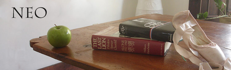
The Name in the Stone – updated [BUMPED UP]
I’m still working on Gerard’s book, and I thought I’d mention a few things that came up in the comments of my earlier post on the subject.
The basic structure of the book was decided on by Gerard, and I’m following that with a few modifications. He’s the person who seems to have wanted it to be called The Name in the Stone, after the lead essay – one of his most well-known – about his uncle of the same name who died in World War II and was lost at sea, Gerard’s discovery of a monument in New York’s Battery Park with his name on it, and an earlier incident in his family about the names.
So that title is a given, as far as I’m concerned.
I know that Gerard also liked books – real books – from his time in the publishing business as editor at Houghton Mifflin, as well as his career as literary agent, but also because he was really into aesthetics and liked the look and feel of a good book. Since this one will be self-published and designed by me, I’m trying to get something that isn’t a piece of junk. There will also be an ebook version for those who prefer that sort of thing, but I consider the hard copy to be primary. One decision involves paperback versus hardcover. I’d prefer the latter, but the price would just go up and up, and prices are already high enough so it might end up being a paperback.
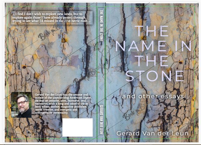
Lately I’ve been doing a lot of fiddling with cover design. Again, that would be Gerard’s bailiwick. But it’s my task at the moment, and I’ve actually been having fun with it and a website called Book Brush. It’s the best one I’ve found for the purpose, and I’ve tested quite a few. Lots of fonts and colors and choices galore, so many that it’s become a big time-waster for me.
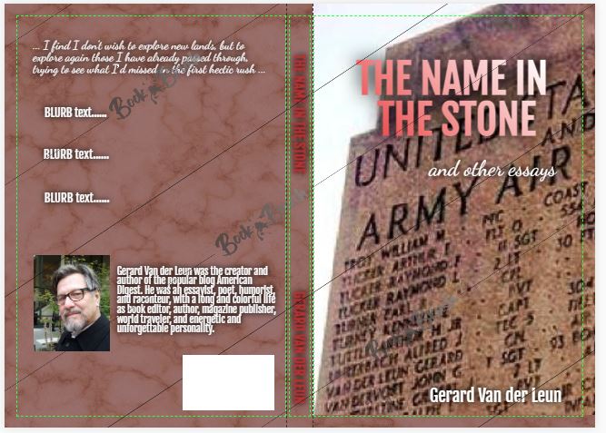
I started out – as shown in my recent post on the subject – with a very prinitive prototype (before I found Book Brush). My idea was to have a photo of the name on the monument, but unfortunately the photo I have is blurry, and it’s very hard to take a photograph of that part of the monument because it’s in shadow and very high up. Scaffolding and a very good camera and lighting would be needed. Later, with Book Brush, I tried all sorts of variations, and they all were blurry (and probably would be pixelated in the actual book cover) and not very pleasant to look at.
So I think I’m jettisoning that idea in favor of something else. What will that “something else” be? I’ve tried many possbilities and have fastened – for the moment – on some sort of attractive stone. Not a gravestone; just stone itself. Here are just a few samples from the many many I’ve designed; I have lots more. Some of these are more finished than others in terms of the back cover (on the left in all the photos) and the spine, but the finished product will have a lot more verbiage on the back than these do. I’ve included one of the “monument” ones, too, but as I said I think the finished product would be way too blurry to use that photo. Imagine these as 9 X 6 books.
What do you think?
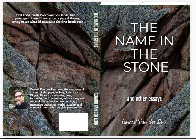
I like the second one, and the others aren’t even close. I like the bold color (and I think Gerard was a rather bold personality); the title and the author’s name stand out clearly.
Kate:
That one does have the most contrast. It’s my most recent effort.
I can change fonts and colors of letters easily, but it’s hard to get them to stand out. I may get some help with that from someone who designs book covers.
Gerard’s personality was very bold. 🙂 . I have no idea what he would have chosen for a book, though. He liked artistic and interesting photos.
I like the second one also.
Not sure if itll help you narrow down your options, but a graphic designer once told me that if you squint and you can’t read it then the font and/or color is not a good choice.
That’s it for my two cents!
I rather like #2.
Megan:
That’s interesting. Of course, I can change the colors, or make the fonts thicker and bolder, but I don’t find that aesthetically pleasing. I’m curious what people think of the backgounds themselves, because as I said, the fonts and colors and sizes of the letters can be changed.
I do rather like the contrast of #2 myself, though.
One more thing; these are small photos and the books are big, which makes the print much easier to see and read.
The second one seems better to me, though I don’t care for the font of “and other essays.” Should it be moved up a little, too?
The first cover ties in closely to the subject of the title essay, but there are problems with the color scheme and the placing of the photo and title. That blurry first “The” is not good.
I read the essay. It was very moving.
No. 2 gets my vote. It has the cleanest, simplest look, IMO.
Given this info, a few thoughts –
Might it be possible to get a better quality photo of the stone from some entity which oversees the monument? Also the large eagle flanked by the stones or the eagle statue and inscription are nice images: https://www.abmc.gov/sites/default/files/publications/East%20Coast%20Memorial%20%282019%20brochure%29.pdf
Maybe a graphic artist would be able to manipulate the picture you have to sharpen it up…
#2 is the best by a country mile, and I can’t wait to read his essays. Kudos for a labor of love Neo.
Yes, number two. The texture of the granite and the colors draw my eyes, while the cracks and small rugosities pique my interest. (Of course, I used to be a rock climber.)
American Digest is a place of substance – like the granite rocks. It fits.
I rather like the font on number four. I think it would look good on the granite background.
Well, you’ll just have to do the best you can, and talk it over with him when you also leave this life.
I think the stone you chose for #2 is interesting and visually attractive.
I tried hard to like the others, and in fact there is something good to be said for each of the others, but I keep coming back to #2 as a favorite.
I’d like to see a different font for the lettering. Maybe once you’ve decided upon the cover design, another post soliciting our opinions on the font lettering might be a workable idea.
Ok, two more cents:
Canva has some fun book cover ideas…they have templates that are easily editable, and offer some free art and lots of font combinations.
Megan:
Thanks, but I tried Canva, as well as many others, and for me Book Brush was far superior in choices and ease of use.
M J R:
Yes, it’s easy to fine-tune the lettering. Many many choices of type, color, size, spacing between letters, spacing between lines, position on page. It’s almost dizzying. You could spend a year on the choice.
Is there someone in the NYC area with a drone/camera who could try to take a better picture? And perhaps there is a designer in the crowd who can advise you on design? That would let you concentrate on the words in the book…
Sorry, but I have to go against the consensus and vote for number one. Even though it’s blurry, not particularly artistic and hard to make out the name, that doesn’t matter. To me it’s interesting and also gives a hint of what can be found inside the book. Knowing nothing else, it’s the only one that would make me pick the book up in a bookstore and investigate. Just my opinion.
It looks like most people favor the second selection, but I think it is very “generic”. It gives no hint of what the name in the stone signifies to Gerard. I vote for the first selection, but would like that name in the stone to be moved up a bit so purchasers can really see the connection to the book’s title.
(I read his essay at American Digest when he first wrote it and found it extremely moving.)
neo:
If, Battery Park (the monument) would allow it; a quad copter drone and a good camera might be a better alternative than scaffolding and all that.
I’m partial to the fractured granite also.
Art takes a lot of thought.
neo:
I like the concept of #1 a lot, but in practice it is busy and confusing.
#2 pops as a composition, but one wonders if The Name will be found in that rock formation.
Absent concerns with time and money, I suggest a reshoot of the Battery Park section with an eye to the cover.
I think you’ve got good enough visual sense to stick the landing on this. Plus it’s a meaningful personal touch.
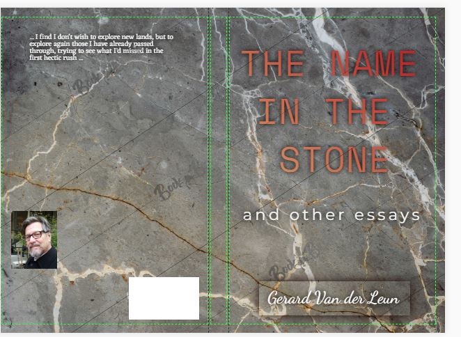
Number three stone, the marble. Much less visual conflict. 2¢s
One way to get the letters to pop is to double layer them. Use a darker lettering as a shadow. One text field atop another allows you to incrementally adjust the shadow width. I’ve found it works on a range of background colors.
Scan Amazon books for “Tales from the Vaults” for examples.
Given the four mocks, I’d say #2 — the title is by far the most readable. The others might work but need something to cause the title to stand out from the background much much better. #2 just “pops”. The others very much do not do a fraction as well.
You may find this of some utility, MAE is a fiction author who has done well enough on the “indie” circuit to give up his day job.
There may be useful insights about promotion and physical publication which might help.
https://www.amazon.com/Every-Writers-Dream-Insiders-Bestseller-ebook/dp/B07VN2XD1G
#2, definitely
more meaningful than a random stone
is it possible to highlight his name on the phone, and make that the byline?
he is super lucky / fortunate to have you to do this for him
will be great, cannot wait
What Chris B and Basherte1 said; if the Battery Park monument could be re-photographed (whether by a drone or some other method), I think it would be better for the cover (because it is more personal) than the more abstract photos of rocks or polished stone. As for the font– well, I like the font in #2, but it looks like you have a wealth of fonts and colors to choose from– a real embarras des richesses. I expect, though, that when you see the best choice for the cover text, you’ll recognize it at once.
I like #1, with the monument. The rest are just rocks.
I think the monument background works– even more so if it’s softened to the point it’s unreadable. The fact you said it’s out of focus sounds like the amount of enlargement of the photograph. Use fonts from title #2– which I like better (proper leading and better balance) needs to be more leading. I also don’t care for the script text for “and other essays.” Using that spacing also allows you to get away from the background shadow and the graduated color in the font.
Since you’re using the title of one of his major essays, is there a theme to some of the other essays. You might use a background that highlights or thematically connects with some of the other essays.
I do like #2, but I think it confuses what the name in the rock is.
Number 1!
To me the others look generic. Number 1 lures me in.
#2 Bold and Masculine
Number one.
Grabs me right away, I would know just what the title essay is about, and that too would grab me. That the names are blurry matters less to this myopic person for whom much of the world is blurry, with or without glasses.
‘
I’d be more interested in a sample of the pages. The cover’s job is to get someone to buy the book. The prose within is what guarantees the purchaser doesn’t regret buying. Mr. Van der Leun has written the prose, but it is up to you to choose the display, which makes a difference to keep a purchaser reading.
Many thanks for taking on this task, which must seem daunting. Keep at it!
I wish you well in this project. That you are doing this shows a generosity of spirit.
This may not work at all, but I wondered and I googled (well, Binged), and there is such a thing as “tombstone” fonts. Perhaps too crude or not adaptable enough for a book cover, but in theory you could put make the title, author etc. in the “stone” instead of superimposed on it.
I have no strong preference for the book cover. However, Gerard wrote some excellent poetry, too, and I would like to see his poetry as well as his essays.
bob sykes:
I have two books planned. That’s book number two.
I hold out hope that the suggestion to contact the American Monuments Group will lead to a better view of the actual stone.
1. #2 The colors are too dark and I am not comfortable with the contrast within the stone.
2. #3 Is too boring and means nothing.
3. #4 Does not appear to be anything particular–could be tree bark.
Have you tried cropping the picture that Gerard has on AD?
What about taking the picture from a bare blank side–if there is a bare blank side?
What about contacting the school photography or even the art program at your local university?
The idea I really love is what we in our house call “get a kid”. Find a kid who loves photography–I think he might already have a drone!
If it is not possible to get a picture of the original stone work either up close, or from a distance, then maybe everyone here can take pictures of stone(s) and send them to you! If you find that it is absolutely impossible to use the original stone pillar(s) then maybe branch out into stones in a creek, or a large handsome stone from a distance. There are plenty of good stone pictures from the Yosemite area which is close to where Gerard grew up.
Finally, if I have to pick stone color I would favor the lighter grey of #3,but it is so boring and Gerard was not boring!
I think you are expecting too much from yourself. You have some beautiful gifts, dear Neo, but maybe you need to not expect soo much. I don’t recall hearing any mention of your artistic talents!
Back away and give yourself a break!
One trick that I have learned in doing graphics for book covers with MS Publisher is to ‘bevel’ the lettering in some fashion, do a very narrow outline of the letters in a complimentary color, and to do a very faint pale or dark ‘shadow’ to make the lettering all pop against the background design.
I do like number 2 for being easy to read in thumbnail, but a very much clearer picture of the memorial would really bring it home – perhaps, as Huxley suggested, a re-shoot with a drone.
I just remembered that there is stone carver over on Gerard’s website. He does beautiful work in marble, maybe he could help!
A few thoughts:
1) #2 is by far the best font. Clean, clear, easy to read.
2) The problem with the name in the monument itself is that the orange color is really hard to actually contrast anything off of (whether white or black). Not sure a cleaner picture with better lighting will get you where you need to go on a DIY cover, because it is the colors that makes it hard to read.
3) I suggest you either use as the front/back cover a) a black granite stone along the color story lines of the Vietnam Vet memorial (which visually everyone knows and thus the imagery will apply); and either overlay that with his name carved in that stone using the same font as in the existing memorial in Battery Park; or b) use the eagle statue with as much contrast as possible with as bright of a blue sky as you can, and put the title and author name against that black part of the background on the eagle/base of the memorial. The darker granite will also contrast more nicely with the photo you have on the back cover.
4) Since this is a memorial book for Gerard as well, I would size his picture to be roughly 1/3-1/2 of the back page. He can be bigger than a thumbnail.
5) Then if you can, try to do the best color insert into the book itself of the original memorial pictures, where you won’t have to re-size the photo, or if you do it as a black and white, you may actually get a better readability because you won’t have the orange.
#1 would be my choice.
Both the angle and the name reinforce the idea of a serendipitous discovery.
It being contained on a WWII memorial gives a connection to many other people that may find solace in the story.
The wording on the back should be web log as opposed to blog (sounds better).
Since Gerard wrote a lot of different things, essays, poetry, etc., it should say:
The Name In Stone
the writings of
Gerard Van Der Leun
The background coloration of the cover should be grayish stone but a less fancy type.
Title script, “The Name In Stone”, should be the “chiseled” type, like found on a headstone.
The title chisel font should be dark gray, almost black, but the interior slants of the font should be dark gray on the bottom and the left, and light gray on the top and the right.
Like this: (see the word “chisel”)
https://st4.depositphotos.com/19098526/25293/v/1600/depositphotos_252931406-stock-illustration-chisel-alphabet-vector-font.jpg
The subtitle script “the writings of Gerard Van Der Leun” should be like a hand made quick cursive type, like this:
This font should be satin black (non glossy).
https://i0.wp.com/befonts.com/wp-content/uploads/2021/08/1-41.jpg?resize=1536%2C1024&ssl=1
I’d prefer hard cover, but a perfect binding soft cover is OK too.
I’m going to buy one no matter what.
That’s my 2 cents.
ghostsniper:
This book is 100% essays. Thus, the subtitle. Poetry will be in a second book.
I like the second one, it’s more mysterious. The first looks like a tombstone or memorial which I guess is the point of the story but limits the imagination, as well as the last two of polished stone.
The “name in the stone” can mean anything when backed by the unfinished rock.
Yawrate:
That’s pretty much my thinking, too. After all, the book isn’t about the military or a monument.
eworth:
Gerard’s photo is small because I hope to add a bunch of blurbs on the back. You are not seeing the completed back cover in these photos.
#1. It gives instant recognition of the meaning of the title. I wouldn’t worry about having the specific name pictured. Just take an awesome shot of the monument and use it. The importance is the recognition of why the book is named what it is….not a specific name. And I agree with another commenter that said all the other ones are just rocks.
You want stone to really be stone. The third and fourth look too much like the “marbled” papers in the back of old books.
Also, as you look at other book covers, think about the mix of cursive and non-cursive. Is it that common? Does it really work? I’m a little skeptical, but wouldn’t reject it out of hand.
To my old eyes, all but #2 are effectively unreadable and my eyes just skip over them.
Get a drone. Drive down to NYC. You can get all sorts of good pixs with a drone.
Agree with eworth #4.
Just an FYI and by no means a suggestion to add to your work load.
When I first started my story series I needed a suitable font for my languages and couldn’t settle or even pick out anything close to what I imagined. There seemed two options: Hand draw every character and arrange them into words and sentences or purchase a font editor.
Instead, I found a free one (Type 3.1) that I could easily enough to use and, like the project OCD guy that I am, I made two sets; print and cursive.
NIcest thing is, it allows you to open any font on the system, pick a character that’s close and import it into your font where you can modify it.
Like I said, not at all a suggestion for your use. You’ve got a plate as it is.
Abraxas on October 1, 2023 at 1:47 pm said:
…
Also, as you look at other book covers, think about the mix of cursive and non-cursive. Is it that common? Does it really work? I’m a little skeptical, but wouldn’t reject it out of hand.
_________________________________________________________
I agree with Abraxas’s comment about mixing cursive and non-cursive fonts. To me that looks very awkward. In my life, I must have looked at a million book covers, but I have no expertise in publishing or book design. What’s my free advice worth? Negative numbers.
Mark Elliott @ 11:52 am has a good point, I think, and the reason I suggested you could soften the image to the point it was recognizable as names on a monument, without revealing the names.
Also I like the more modern font in #2. It looks like Tahoma, though it’s been a along time since I was doing any layouts.
I like #1
My mom had fake tile in her bathroom that looked like the marble in #2. I always hated it.
So not an unbiased opinion.
Many blessings to you for all your hard work on this.
I like # 2 for its clean and crisp look; but, IMHO # 1 is much more powerful.
Seeing the names chiseled into the stone is quite moving. I think it conveys that which struck Gerard so strongly in the first place and alludes quite strongly to his poignant essay. Is there any way possible to get a clearer picture of the monument?
I guess I’m the only one who likes #3. It’s the kind of stone one would engrave on, and the title really pops.
Oligonicella:
Book Brush has tons of free fonts, actually.
Abraxas; Cornflour:
Mixing fonts like that is very very common these days.
Except for the first, the covers are misleading.
I can see the argument for #1, given the topic of Gerard’s essay, but if so, make the title lettering some other color, and more legible.
Kate:
Of course I tried many colors and fonts. One of the problems is that it is very difficult to make letters stand out against that background.
Ira:
I have no idea what you’re talking about. Those later 3 covers are generic and could refer to nearly anything, and the essays are extremely eclectic. It is actually the first cover, if any, that is misleading, because it only refers to one essay, which constitutes only about 1/50th of the book, and it’s only about a portion of that essay, at that.
https://www.canva.com/learn/the-ultimate-guide-to-font-pairing/
I meant to mention this in my earlier Canva post. It gives some nice font pairing ideas and advice.
Hello Neo,
I have not read through the comments, so I may be repeating someone else’s but
The last one lower right, but with a chisel or relief font. In caps
FWIW. If I were picking photos for the jacket I’d put the two on the AD homepage on the top of my list. The Battery Park pic could wrap around the jacket and I could see the pic of the author in the lower right corner of the back of the jacket. They are both very engaging and would make me want to pick this book up to see what it’s all about. I don’t know if anyone can do better than the originals from the essay on AD that illustrate who this guy is and what he’s about.
Personally, I like #1, mostly because it says “US Army” and you can tell there are names on it. For a cover, it adds to the mystery that the names are blurred.
Also, you may want to consider the “trade paperback” format. The cover and binding are better quality than a regular paperback and the size of the book is larger than a paperback but somewhat smaller than a hardcover.
I tend to be literal and prefer #1. Even if it is only one essay, it is the title essay, and I like it. The font does need to pop much more even if that obscures the picture some. The photo is instantly recognizable and doesn’t need to be super clear. Though pixelated is bad. I’m guessing a decent Photoshop operator can make sure it isn’t pixelated.
TommyJay:
I communicated with a recommended cover designer who said when blown up big enough for a cover it would be too pixelated. Not just blurry but pixelated.
Not just blurry but pixelated.
neo:
This is why I recommend a reshoot, presumably with a good camera and a good lens and good light.
huxley:
I have a post planned for tomorrow which will explain why I’m pretty sure that’s not a solution, either.
Re: pixelated vs pixilated
For those who wonder about such things because I do.
___________________________________
Pixelated is used to describe digital images in which individual pixels are discernable, as when you look closely at a large photo and can see the tiny dots that make up the image.
Pixilated (coined from pixie, a pixie being a cheerful, mischievous sprite) is usually used to describe things considered whimsical, or people who seem dazed or lost in thought. While pixelated is a late 20th century coinage, pixilated has been in use since the mid-19th century.
https://www.merriam-webster.com/dictionary/pixelated